The UNOCU dashboard has always given you the data. Every APY, every reward, every position — it was all there. The problem was how it was presented. Twelve to sixteen separate widgets per page, each showing a single metric in isolation. You could see everything, but you had to scroll, cross-reference, and piece together the story yourself. Data without context is just noise.
Today we are shipping a major redesign across all four core modules: Umbrella, Nurture, Compound, and Utilize. Each module now opens with a single unified command-center widget that answers the most important question for that page in one glance. The old widgets are not gone — they are still available through the widget picker for anyone who wants a custom layout. But the default experience is now focused, coherent, and built around insight rather than raw numbers.
Umbrella — Your Treasury at a Glance
Umbrella is the homepage of your treasury, and its new command center is designed to eliminate the need to navigate anywhere else for a high-level view. The top of the widget shows your Total Portfolio Value with a live daily P&L indicator — green when you are up, red when you are down. Below it, a Performance Chart lets you toggle between 7-day, 30-day, and 90-day views, with historical snapshots updated every 15 minutes.
The real upgrade is Smart Alerts — contextual, clickable notifications that surface what needs your attention. If an asset dropped more than 5% today, the alert tells you which one and links directly to Obtain. If you have idle capital sitting unstaked, it calculates the annual yield you are missing and links to Compound. Yield coverage warnings link to Nurture. These are not generic notifications. They are specific, actionable, and tied to your actual portfolio.
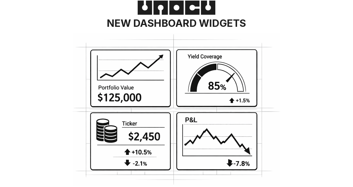
The command center also includes:
•Asset Allocation — every holding with allocation percentage, average cost basis, and a profit/loss indicator.
•Module Pulse — a single row showing the health of Nurture (yield coverage percentage), Compound (total earned and APY), and Utilize (P&L and win rate), so you get a cross-module snapshot without leaving Umbrella.
•Watchlist — track assets you do not hold yet, with live prices and 24-hour change. Defaults to BTC, ETH, SOL, XRP, and ADA. Fully customisable.
•Portfolio Heatmap — a visual grid where each asset block is sized by allocation percentage and coloured by 24-hour performance. Deep green for gains, deep red for losses, with proportional intensity.
•Live Price Ticker — a scrolling bar at the bottom showing real-time prices for your held assets.
Nurture — Is Your Treasury Self-Sustaining?
Nurture has always tracked yield and expenses. The new command center reframes that data around a single question: is your treasury generating enough yield to cover operating costs?
The headline metric is Yield Coverage Percentage — the share of your operating expenses covered by crypto yield. It is colour-coded by health status: green for Healthy (100% or above), amber for Growing (75–100%) or At Risk (50–75%), and red for Critical (below 50%). An animated progress bar marks the 100% break-even threshold so you can see exactly how close you are.
Below the headline, three stat cards show total monthly yield income, months of runway remaining at current burn, and monthly expenses. A horizontal bar chart breaks down yield sources — staking rewards, compound interest, trading P&L, and manual business revenue — each with amounts and percentages. Expenses are broken down into editable categories (hosting, salaries, legal, subscriptions, and more), each with proportional bars.
The most forward-looking feature is the Path to Self-Sufficiency projection — a curve showing when your yield income is projected to reach 100% of expenses at the current growth rate. Smart Alerts flag revenue gaps, runway dropping below 12 months, and unstaked asset opportunities. If you have QuickBooks connected, revenue and expense data syncs automatically. Otherwise, manual entry works just as well.
Compound — Making Staking Feel Real
Staking rewards can feel abstract — numbers that accrue slowly in the background. The new Compound command center is built to make that growth tangible.
The Total Yield Hero displays your combined staking rewards and compound interest front and centre, with an animated live earnings ticker that translates your APY into real terms (for example, "Earning $0.58/hr"). An APY Ring — a circular donut — shows your blended APY across all staking positions, and a quick stats row summarises total staked value, monthly yield, active positions, and network count.
Individual staking positions appear as clean cards — ETH via Lido, SOL native staking, and so on — each showing the asset icon, staked amount, APY badge in green, and total earned to date. The Compounding Growth Projections chart shows your projected portfolio value at 1-year, 3-year, and 5-year horizons based on current APY, making the power of compounding over time visually clear.
If you have idle assets sitting in your treasury, the Unstaked Nudge surfaces a green alert with the potential annual earnings you are missing — for example, "$97K unstaked — could earn $3,200/year." Smart Alerts also flag APY drops and new staking opportunities as they appear.
Utilize — Your Trading Dashboard
Utilize is where active traders live, and the new command center is built as a focused P&L dashboard.
The P&L Hero dominates the top of the widget — a large total profit-and-loss figure with a daily ticker pill showing today's change (green arrow up or red arrow down). Next to it, the Win Rate displays your percentage with a mini donut ring visualising wins versus losses.
A Cumulative P&L Chart plots your 30-day performance as a line chart with area fill — green when you are in positive territory, red when negative. Below the chart, Open Positions cards show each live trade with the asset pair, a Long or Short tag, and the current P&L. Two highlight cards — Best Trade and Worst Trade — call out your standout performance on each side.
All twelve original Utilize widgets remain available in the widget picker for traders who want granular depth beyond the command-center view.
Still Your Dashboard
The command-center layout is the new default, but UNOCU remains fully customisable. Every original widget from every module is still accessible through the widget picker. You can add, remove, and resize any widget to build the layout that works for you. The command centres are the smart starting point — not a locked-down replacement.
The redesigned dashboard is live now. Log in to see the new command centres across Umbrella, Nurture, Compound, and Utilize — or explore the full widget library to build your own view. Try it at unocu.com.
Disclaimer: This content is for informational purposes only and does not constitute financial advice.